
Worst Websites. Ever.
So what exactly qualifies a site to be one of the worst websites on the internet?

At NeONBRAND, we don’t like to be the bearers of bad news. But that doesn’t mean we can’t offer some constructive criticism now and again. And that’s exactly what we’re doing by showing you the worst websites ever. By showing you what fails, it’s a whole lot easier for you to recognize a good website – outside your business and within it.
From unconsolidated information to random art to obscene barrages of colors, lights, and music, these sites are worse than ineffective — they’re unattractive. And if no one is attracted to your site, they just might lose interest in your business too.
Check out these failures (and nominate your own in the comments below!)
Space is the Place
Check this out. We hate to bag on the innocently naive, but this site is virtually cornea assault. Because the page is organized completely linear, your eye has no idea where to go. Not to mention that the photos are badly placed (and just badly taken). An innocent onlooker could spend a good 10 minutes on that page without discovering its purpose — not that you ever would.

Serene Naturalist
Let’s say ditto to this one. With the crazy randomness of the photo selection, the cheesy music, and the winged friends of nature that flutter through the page, this site does just about anything but convince me to get a massage. In fact, I’m stressed so much just reading it I may need a cup of chamomile just to get to bed.

Flood Disaster Recovery
This is a unique one, as we came upon this website when they came to us for a marketing plan. First thing we needed to work on was this website! Pretty remarkable that even in 2020 these sites still exist out there!

Space Jam
Now many of you will disagree, and frankly, we probably do too. Instead of this being a terrible website, it’s actually more like an iconic piece of history! A fun one to look at, nonetheless.

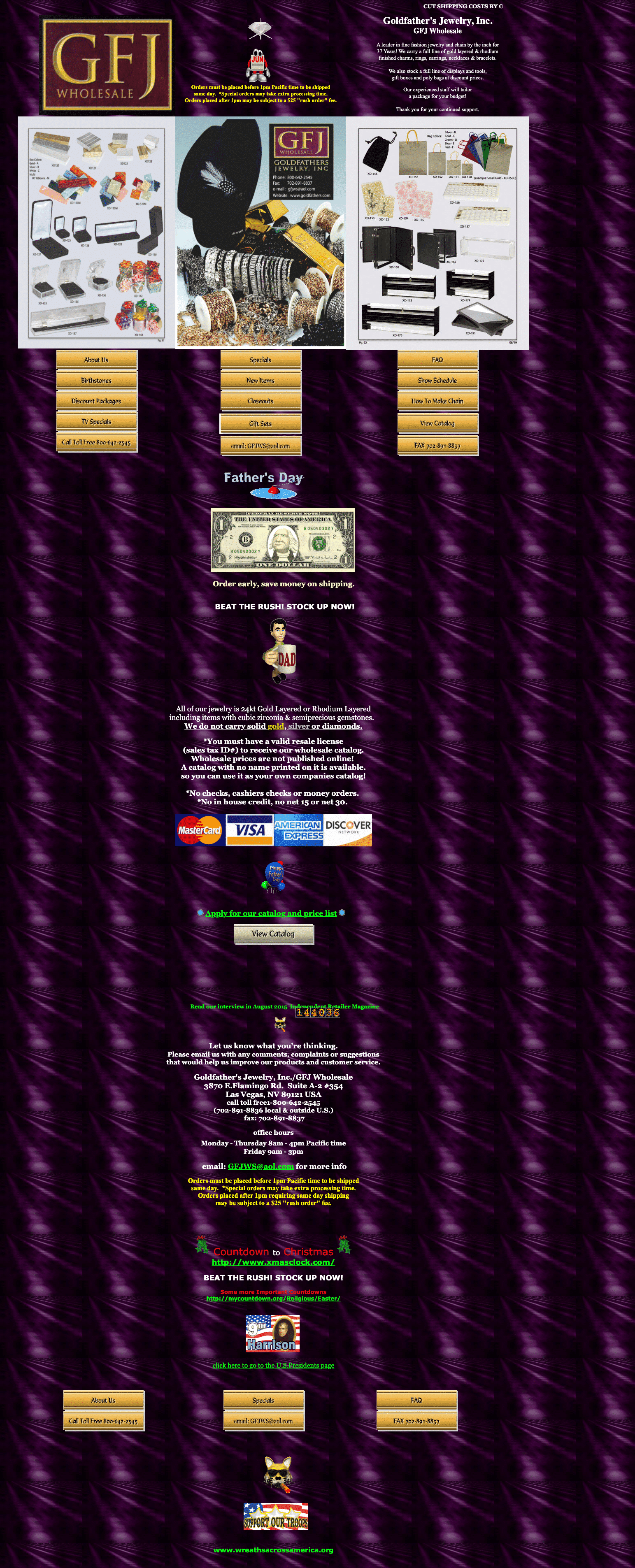
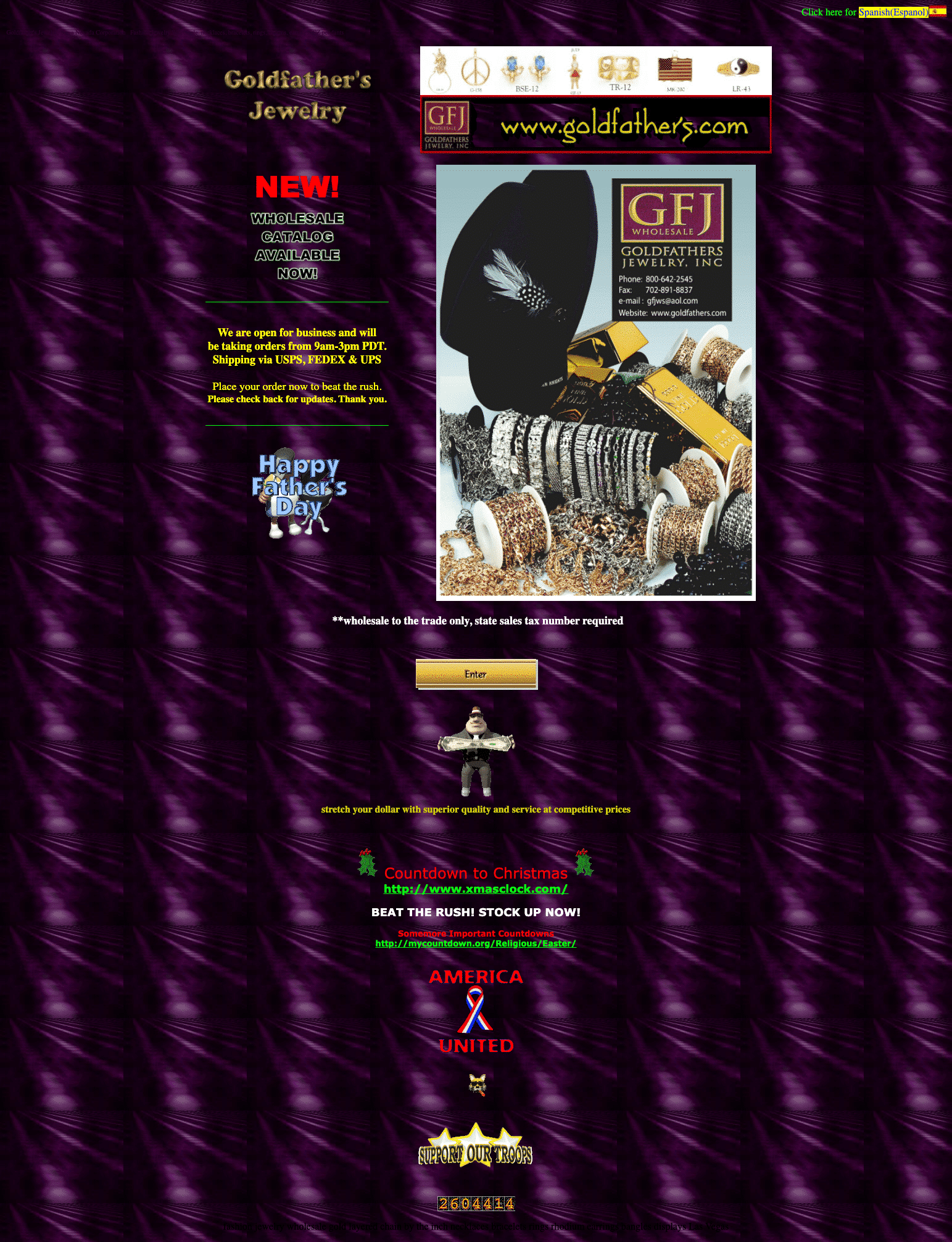
GoldFathers
This one brought back old memories of building websites in the ’90s! My favorite feature is the page counter that ticks up on every page load. This website should be in the website hall of fame, it’s an awesome reminder of the good ol’ days!
Ling Cars
A truly classic terrible website. Ling Cars has been entertaining browsers of the web for many many years. The best part is, the site is clearly profitable for Ling! He has also taken extreme measures to make sure people don’t mess with his site, even to the extent that he put his own face in ASCII characters in the source code! Go see for yourself, right-click anywhere and click “view source code”.


There you have a few of our “favorites.” Are you ready to share your own? Remember — Be nice! (Okay I don’t know if we really mean that.)
